Coding

Creare un tema per WordPress senza utilizzare PHP

Ho appena terminato di pubblicare un tutorial di quattro articoli in inglese su come realizzare un tema per WordPress in sole 3 ore.

Sviluppare un ottimo tema per WordPress senza essere dei maghi di PHP, senza conoscere hooks e filter di WP ma con il solo utilizzo dei fogli di stile CSS è  infatti possibile. Realizzando un Child Theme, un tema figlio.

Continua a leggere »

Termini collegati: , , , Commenti chiusi
English Articles

3HoursTheme – a Tutorial Child Theme for Thematic

3HoursTheme is a free tutorial child theme for Thematic Framework for WordPress.

While you can use it, as is, on your blog, it’s main purpose is to give you an initial track to develop your own child theme.

The 3HoursTheme child theme has been developed using CSS-only code and every CSS rule is commentend for your learning aims. It can be a good starting point for those who want to approach WordPress theme developing from a beginner point of view.

Furthermore CSS code has been in-deep explained in my How to create your own WordPress Theme in just 3 hours tutorial.

3hourstheme_home

How to create your own WordPress Theme in just 3 hours

Part I – Build a child theme based on Thematic Framework Theme

Part II –  Style header, footer and posts

Part III – Navigation and widget areas

Part IV – The Superfish Menu

You can find more resources on Thematic Framework developer blog, ThemeShaper. Ian Stewart is writing a more comprehensive tutorial “How To Create a WordPress Theme

I suggest to my italian readers to take a look at Altamente Decorativo. Daniele is writing here good tutorials on same topic. I guess more are coming in the next future.

3hourstheme_post

Download 3HoursTheme

You can download here the 3HoursTheme.

There is style.css code from the tutorial. I included also the function.php containg my Customizable Menu for Thematic for WordPress and the Fireworks PNG source for the background image.

Feedbacks are always welcomes.

Termini collegati: , , , , , Commenti chiusi
English Articles

How to create your own WordPress Theme in just 3 hours – part IV

Forth and last past of my tutorial on creating a WordPress Theme without having to deal with any PHP code.

Previous parts:

  1. Build a child theme based on Thematic Framework Theme
  2. Style header, footer and posts
  3. Style navigation and widget areas

In this part we will style the Superfish (JQuery-powered) drop down menu inherited by Thematic Framework parent theme.

But, before proceding to the menu we will add some retouches to the page styles.

/* by removing #branding width we move blog-title on the left of the page*/
#branding {
width:auto;
margin-left:60px; /* let's add some margin though*/
}
/* a new set of paddings for #branding to overwrite the defaults*/
#branding {
padding:60px 0 80px;
}

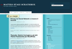
Blog title and blog description are contained in the #branding div. This div is centered to the content area, by default. The above code let us move blog title and blog description to the leftmost part of the whole page. By adding some margins we just moved them a little away from the edges.
thematic_child_step8

We now style also post titles, post header and post footer.

/* font styles for post titles */

.entry-title {
font-family:'Century Gothic',Futura,'URW Gothic L',sans-serif;
font-size:24px;
font-weight:normal;
color:#113242;
}

/* color must be defined also on links */
.entry-title a{
color:#113242;
}

We changed the default font face for post titles. NOTE: I used ‘Century Gothic’ that is not a 100% Web Safe font. That’s means some user could see  blog title in Futura or in a generic ‘sans-serif’ if they do not have installed these fonts on their computer. I wrote a post on Web Safe fonts but it is in italian. I suggest you to learn more on Web Safe fonts and alternatives (sIFR, FLIR, Cufont, etc) by searching this terms on Google.

We reset also colors for post-header (.entry-meta) and post-footer (.entry-utility) content:

/*color of Post Header and Post Footer*/
.entry-utility, .entry-utility a, .entry-meta, .entry-meta a {
color:#4A7D85;
}

Reset all a:hover colors

We defined color links but the mouse over color is still orange as in the default theme (except for the main aside areas where we have already defined a:active and a:hover styles – see previous parts of tutorial)

/* we have not yet changed the hover color of all general links */
a:active, a:hover {
color:#113242 /* deep blue as for links on #primary */
}

This, unfortunately is not enought to get rid of all orange mouse over effects. On the Thematic default theme the orange over color is defined several time (too much times, I guess – sorry Ian). For istance: entry-utility a:active, .entry-utility a:hover {color:#FF4B33;} on line 331 of default.css. These rules have more specificity than ours. So we have to reset each one.

/* but we have also to overwrite specific links hover colors that are defined by defaults */

/* TOO MUCH CODE */
/*.page-title a:active, .page-title a:hover, .entry-title a:active, .entry-title a:hover .entry-meta a:active, .entry-meta a:hover, .entry-utility a:active, .entry-utility a:hover, .page-link a:active, .page-link a:hover,.page-link a:active, .page-link a:hover, #comments-list .comment-meta a:active, #comments-list .comment-meta a:hover, #comments-list .comment-meta a:active, #comments-list .comment-meta a:hover, .comment-navigation a:active, .comment-navigation a:hover, .comment-navigation a:active, .comment-navigation a:hover{
color:#FF4B33;
}
*/

I would prefer this solution:

Use the !important declaration

by using the !important declaration the rule is applied no matter of the specificity of the associated selector.

/* let's do so, instead */
a:active, a:hover {
color:#113242 !important/* deep blue as for links on #primary is for ALL links*/
}

That’s means use ALWAYS this color.

/* but this overwrite also our previous defined styles so we have to rewrite them in that way */
#secondary a:active, #secondary a:hover, #subsidiary a:active, #subsidiary a:hover, #blog-title a:active, #blog-title a:hover{
color:#FFF !important
}
#siteinfo a:active, #siteinfo a:hover {
color:#FFF !important ;
}

If two or more important declarations involve the same property then the conflict is resolved again using specificity

So we should have added this part of code at the very beginnning of our style.css. But this is a tutorial…
thematic_child_step9

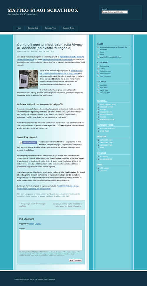
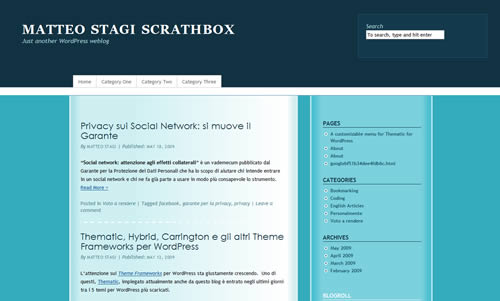
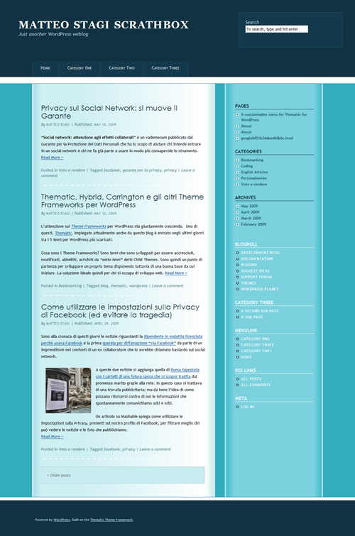
Our theme after last changes

The Superfish navigation Menu

Styiling the menu can be the most challenging job. It’s not easy to inspect the menu code using Firebug because of the dynamic hover classe applied by JQuery.

First of all I do not like that menu is not left-aligned with the content area. This is because the menu is 940 pixel width (line 20 of the thematic inherited 2c-r-fixed.css), while page is 960 pixel width (line 24 of 2c-r-fixed.css).

/*same width of #main to have menu left-aligned with it*/
.menu {
width:960px;
}

Let’add some colors and change font style.

/*items have same background color of #subsidiary #first*/
.sf-menu li {
background-color:#13394C;
}
/*no bottom borders on items. left borders has color used for #subsidiary #first border*. Top border is just a little darker than header background*/
.sf-menu a {
border-bottom:none;
border-top-color:#10303F;
border-left-color:#1D5570;
}
/*same color must be applied to the end-of-menu border*/
.sf-menu {
border-right-color:#1D5570;
}

/*change font style for the menu*/
.sf-menu {
font-size:14px;
font-variant:small-caps;
}
.sf-menu a, .sf-menu a:visited {
color:#FFF;
}

We want to give more space to items tabs. We do it by adding paddings and defining height.

/*we give more space to items tabs*/
.sf-menu a {
padding:13px 28px; /*default is 9px 13px*/
height:24px;
}

We need to change height of menu container div (#access), too.

/*we must change also the height of #access (it's the menu container)*/
#access {
height:51px;
}

We now apply on mouse over styles:

/*on mouse over*/
.sf-menu li:hover, .sf-menu li.sfHover, .sf-menu a:focus, .sf-menu a:hover, .sf-menu a:active {
background-color:#B3E4E9;
}
.sf-menu li:hover a, .sf-menu li.sfHover a {
color: #113242;
}

Superfish is a drop-down menu so we have to style also sub-items.

/*sub-items*/
.sf-menu ul, .sf-menu ul a {
border-color:#4B8AA9;
}

.sf-menu ul a {
background-color:#B3E4E9;
border-left:none;
padding:9px 13px;
height:auto;
color: #113242;
}
.sf-menu li:hover ul, .sf-menu li.sfHover ul {
top:50px;
left:1px;
}
.sf-menu ul li:hover, .sf-menu ul li.sfHover, .sf-menu ul a:focus, .sf-menu ul a:hover, .sf-menu ul a:active {
background-color:#CEF0F2;
}

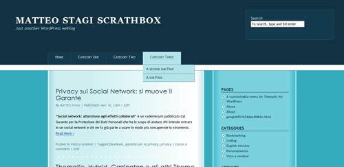
That’s all.
thematic_child_step10

The completed Theme with styled drop-down menu

The comment area

I forgot it! It’s white!

/*I forgot to style the comment area!*/
#respond {
background-color:#AEE2E8;
padding:18px;
border: 1px dashed #4A7D85;
}
#comments h3 {
font-family:"Trebuchet MS", Verdana, Arial, Helvetica, sans-serif;

Ok. We have ended our job. Thanks.
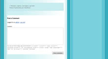
thematic_child_step11a

unstyled comment area

thematic_child_step11b

styled comment area

Download the code

You can download the 3HoursTheme code from here
Termini collegati: , , , Commenti chiusi
Bookmarking

10 estensioni di Firefox per potenziare Firebug

Firebug è l’estensione di Firefox che ogni sviluppatore web deve avere.

Ma Firebug stesso può essere esteso nelle sue potenzialità grazie ad ulteriori componenti aggiuntivi scaricabili gratuitamente dal sito ufficiale Add-Ons per Firefox

Ecco a voi una lista delle 10 migliori estensioni Firefox – Firebug:

Continua a leggere »

Termini collegati: , , , Commenti chiusi
English Articles

How to create your own WordPress Theme in just 3 hours – part III

The third part of a tutorial explaining how to develop a feature rich WordPress theme using only CSS.

Previous parts:

  1. Build a child theme based on Thematic Framework Theme
  2. Style header, footer and posts

Navigation Areas

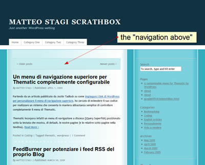
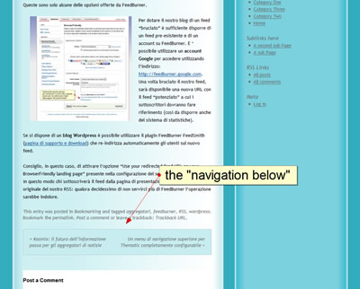
The navigation areas are two: one is placed above the content of the page; the other at the end. They contain links to previous and next posts.

CSS class .navigation is applied to both areas.

.navigation {
background-color:#C7EDF0;
padding:18px;
border: 1px solid #AECED2;
}

By applying a background color and a border to the class we style both with a single CSS rule.

We have to reset the width of two areas, too. It’s defined as 100% on  Thematic Theme default.css. We have added paddings and, due to the CSS box model, the two areas are now more than 100% width. Unfortunately the two box width is not defined on .navigation class but un #nav-above and #nav-below IDs.

CSS rules applied to IDs are more specific than rules applied to classes. So we can’t write:

.navigation {
width:auto;
}

but we need to write:

#nav-above, #nav-below {
width:auto;
}

Let’s apply also some margins. Bottom margin on the “navigation-above” and top margin on the “navigation-below”.

#nav-above {
margin-bottom:24px;
}
#nav-below {
margin-top:24px;
}

We had to reset also a specific padding applied to pages that have .paged class applied to body

.paged #nav-above {
padding:18px; /* to reset the default */
}

Save and upload style.css to 3hoursTheme folder on your server themes folder.

thematic_child_step5a

thematic_child_step5b

Widget Areas

On Thematic Framework there are 13 widget-ready areas. For a comprehensive outlook of Thematic areas take a look at this Thematic page structure wireframe and at these three Widget Area maps (thanks to Danny).

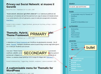
We apply a common style to widget titles on #primary and #secondary widget areas

/* common styles (both #primary and #secondary have .main-aside class*/
.main-aside h3.widgettitle{
font-weight:bold;/* bold */
text-transform:uppercase;/* uppercase */
font-style:normal;/* overwrite the default italic style */
margin-bottom:7px; /* a small margin on the bottom */
}

but we differentiate them by the colors:

/* primary is blu */
#primary h3.widgettitle{
color:#113242;/* color blue (same color of header background) */
border-bottom:1px solid #113242;/* a thin blue line on the bottom */
}

/* secondary is white */
#secondary h3.widgettitle{
color:#FFF;/* color white */
border-bottom:1px solid #FFF;/* a thin white line on the bottom */
}

Now we change text and link appearance on primary and secondary widget areas.

/* common text styles */
.main-aside{
font-size:12px;
color:#1A4E66;
}
.main-aside a{
text-decoration:none;/* links on both primary and secondary are not underlined */
font-weight:bold;
}
.main-aside a:active, .main-aside a:hover {
text-decoration:underline; /* but they are underlined on mouse over */
}

/* links on primary are blu */
#primary a{
color:#1A4E66;
}
#primary a:active, #primary a:hover{
color:#113242;
}
/* links on secondary are white and bold */
#secondary a {
color:#FFF;
text-transform:uppercase;
letter-spacing:0.05em;
}

Let’s style also the lists on widgets by adding bullet images (we can create them with almost every image editing software).

/* bullet images on list inside widgets */
#primary .widgetcontainer ul li {
list-style-image: url(images/bullet.png);
}
#secondary .widgetcontainer ul li {
list-style-image: url(images/bullet2.png);
}

Remember to upload the two images on 3HoursTheme/images folder on your server!

To complete the primary area styling we remove the border around it:

/* we remove the default border around #primary */
#primary {
border:none;
}

Below the result of our CSS editing.

thematic_child_step6

Subsidiary widget areas are on header and footer that are blue so text must be lighter

/* subsidiary widget areas */

/* Widget Titles have same color of blog-description, text and links are white*/
#subsidiary  h3.widgettitle{
color: #B3E4E9;
}
#subsidiary, #subsidiary a{
color: #FFF;
}

Absolute positioning

We do not need three widget areas on footer. But it would be cool to have it one on header to put there a search input.

By using absolute position we can entirely remove a div (or others XHTML box elements) from the normal flow of the document and move it everywhere we want.

The edges of absolutely position elements are defined by left, right, top and bottom CSS rules that specify the offset from the edge of the containing block.

The containing block is the nearest ancestor element with a position that is defined other than static

If no ancestor element has position defined, the containing block is the root element of the document: that is our case! left, right, top and bottom rules define offset from the border of the entire page.

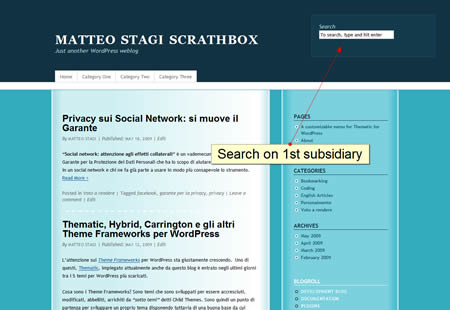
/* we move the 1st Subsidiary (#subsidiary #first) on the header, where we can put search box or banners or whatever else*/
#subsidiary #first {
position:absolute;
right:20px;
top:40px;
z-index:1000; /* we put it on top, elsewhere it stays on the back and it doesn't appear*/
}

/* add a different backround and some borders to the 1st Subsidiary*/

#subsidiary #first {
background-color: #13394C;
border: 1px solid #1D5570;
padding:20px;
}

z-index is important for absolutely position elements, since they can overlap: it defines which elements is visible.

Save you style.css and upload. Go to Appearance -> Widget on WordPress administration panel. Remove “Search” from primary if presents and put it on “1st Subsidiary Aside”. Save and refresh your blog page.

thematic_child_step7

Continue….

Learn to style the Superfish enabled menu of your Thematic Child Theme.

Part IV – Style the Superfish drop-down menu

Termini collegati: , , , Commenti chiusi